We all know that content is the king. Yet, the way your mini-course looks is also a part of your communication and branding. In order to make mini-courses more coherent with your marketing needs, you can customize your mini-courses’ design with various options. These options include different card layouts, themes, fonts, font sizes, colored backgrounds and other choices related to appearance.
You can customize either an already existing mini course or create a new mini course from the beginning. Let’s see how easy it is!
Theme #
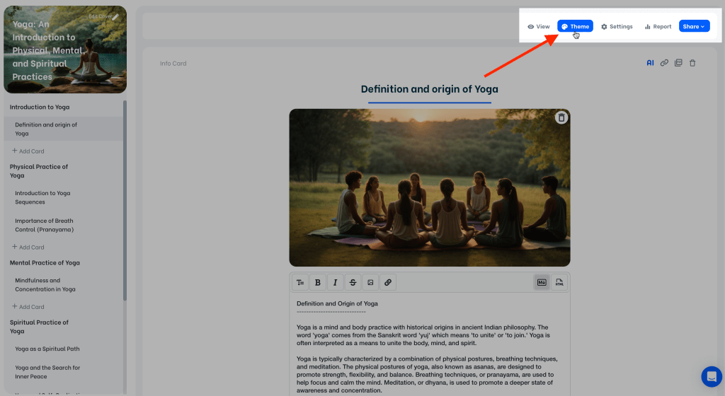
On your mini-course editor screen, click on the “Theme” button, which is located on the upper right corner, to see features about layouts and customization.
Theme Settings #
From Flat to Sprinkle, Mini Course Generator provides 23 different theme presets for you. These presets are fully designed with their font settings, color options, and various card & background options. The presets also have different options of color. For example, for Flat theme preset there are 6 color options. After you pick a color, you can preview each preset.
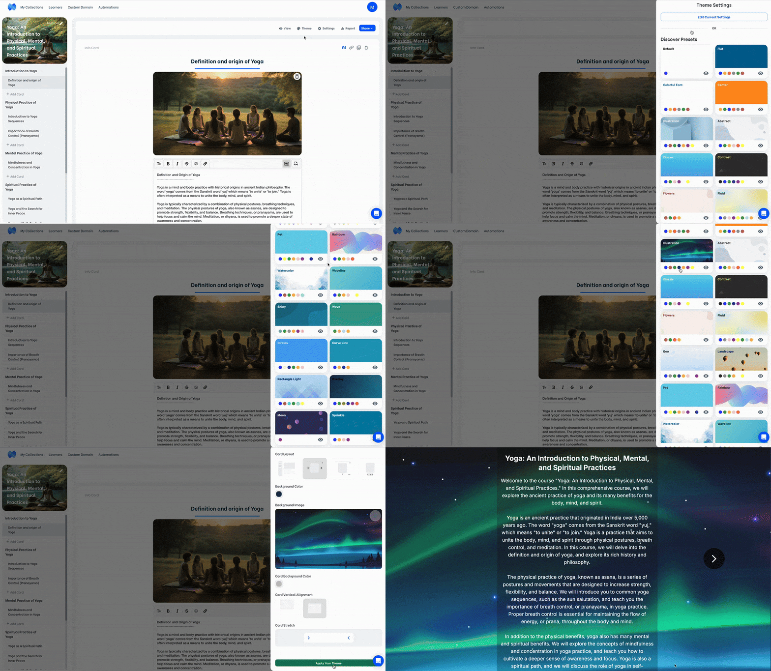
If you want to go back to the default looks of your mini-course, you can pick the Default theme which is located in the first place.
After you decide on a preset, you may leave it as it is or customize your mini-course design further by clicking on the “Edit Current Settings” button.
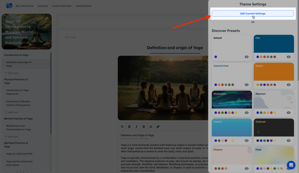
Theme presets are provided for your ease. Yet, not picking a theme preset at all is also an option. You can start customizing your mini-course directly by clicking on the “Edit Current Settings” button. These settings include several options regarding layout, fonts, backgrounds, card options, etc.
Card Layout #
There are four different mini-course card layouts you can choose from. Each card layout has a different placement for the next card button and the progress bar. The choice you make will be valid for both computers and mobile devices, whether embedded in a webpage or not.
The difference between four layout options on computer is illustrated in the image below.
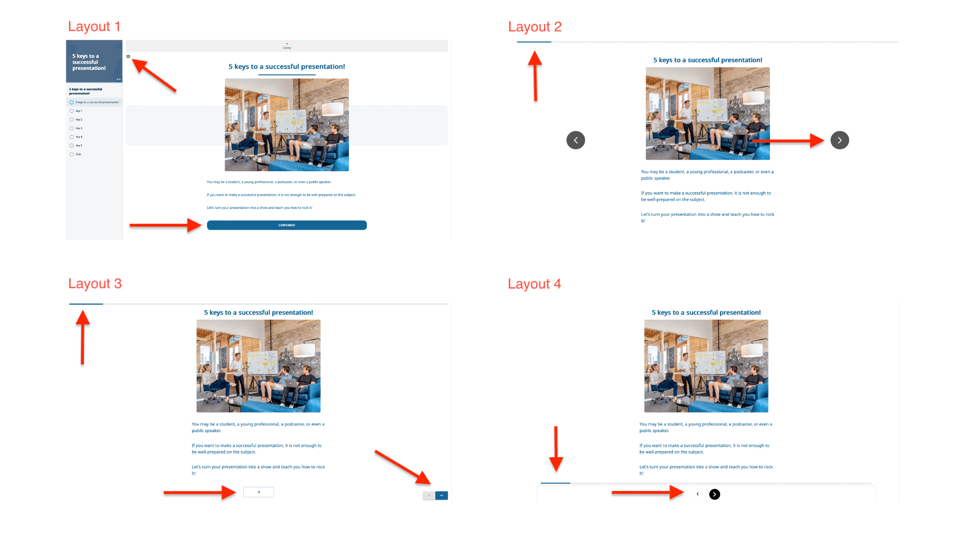
The first mini-course card layout comes with a navigation panel where the sequence of all cards in the mini-course can be seen at once, whereas other layouts do not.
Additionally, the default mini-course card layout includes a “related mini-courses” section, which shows other mini-courses in the same collection, at the end of each mini-course. However, other card layout options do not show the “related mini-courses” section.
Along with where the card is placed, the placement of the next card button, the progress bar and the social share button is changed with the layouts.
The difference between four layout options on mobile is illustrated respectively below.
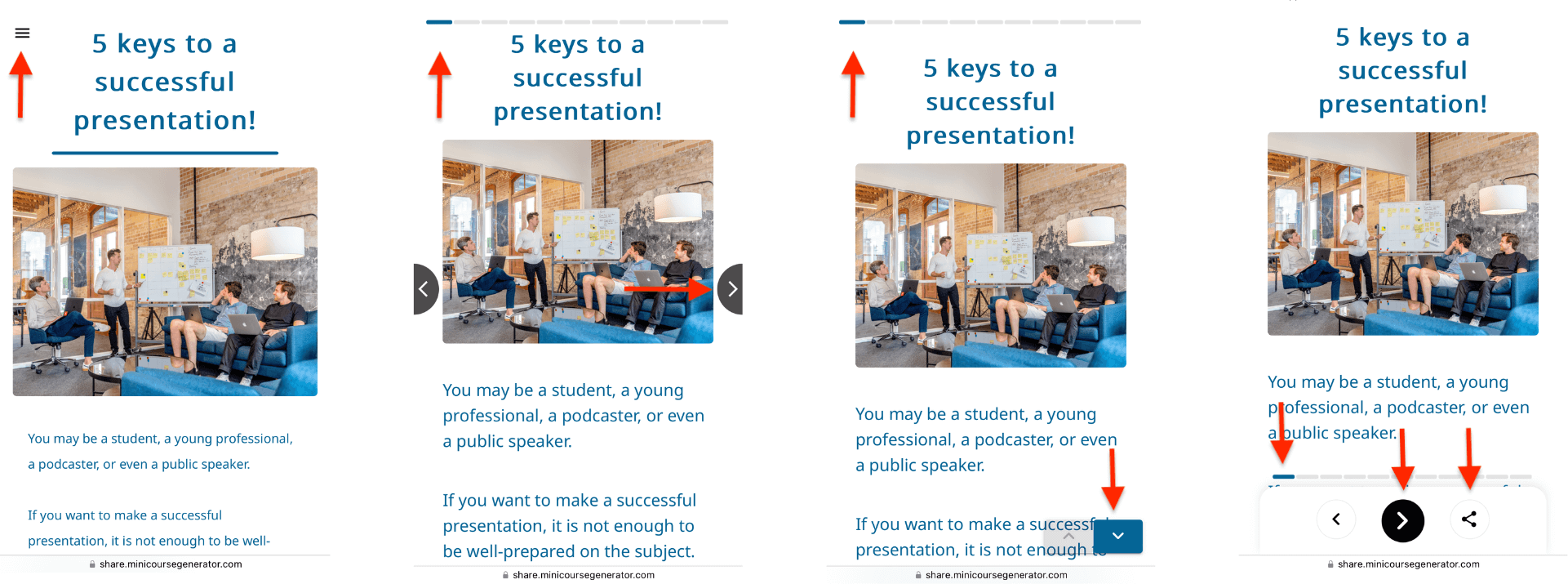
In the first layout, your learners can use the button on top left to see or hide the navigation panel. The next card button is at the bottom of the page.
Depending on the length of content in your cards and the way you will share your mini-courses, you can go with the combination you like.
Find below the same mini-course in four different card layouts. Each of these mini-courses represent mini-course card layouts respectively.
First mini-course uses the default layout, which doesn’t allow changing card alignment or card stretch. Second, third and fourth mini-courses use the card layouts respectively. For these mini-courses, card vertical alignment is middle and card stretch is medium.
Click on the links below, both on computer and mobile, examine the performance yourself, and choose a layout for your mini-course accordingly.
Mini-course using default card layout
Mini-course using card layout 2
Mini-course using card layout 3
Mini-course using card layout 4
Card Vertical Alignment #
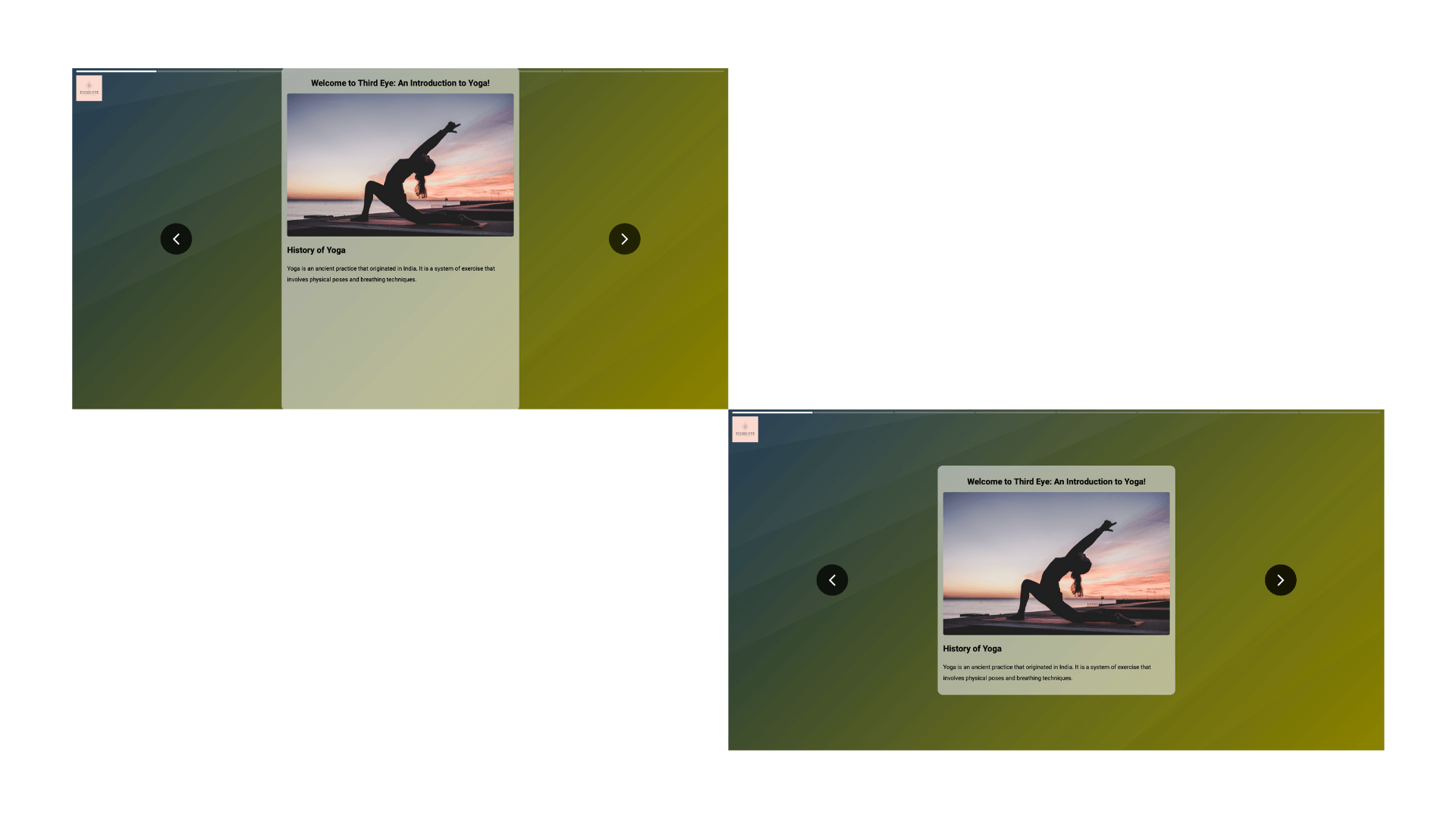
Here you can choose whether your cards should be aligned at the top or middle of the page.
Note: This option is not present for the default card layout.
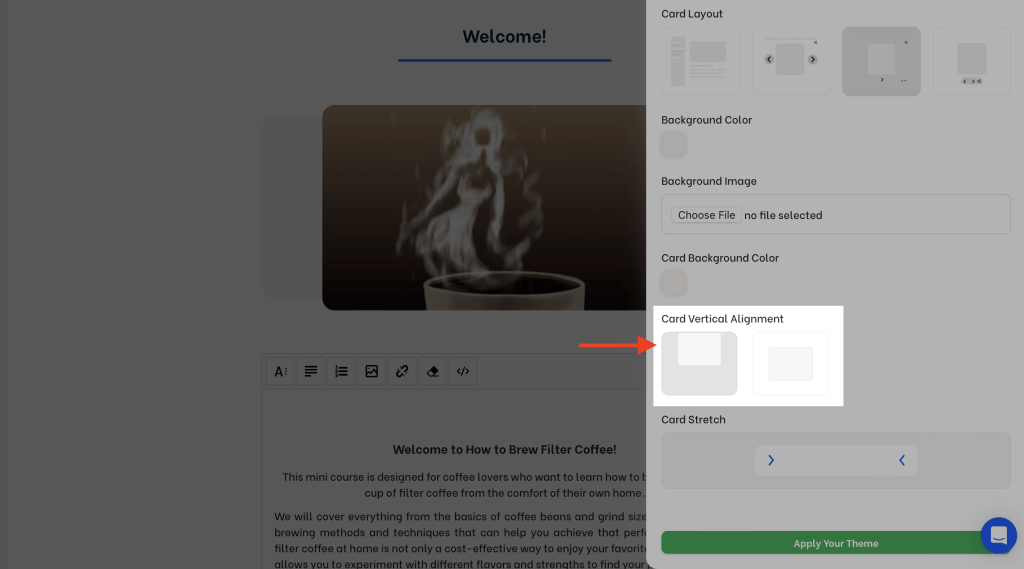
Find below the same mini-course card showcased in both alignment options.
Card Stretch #
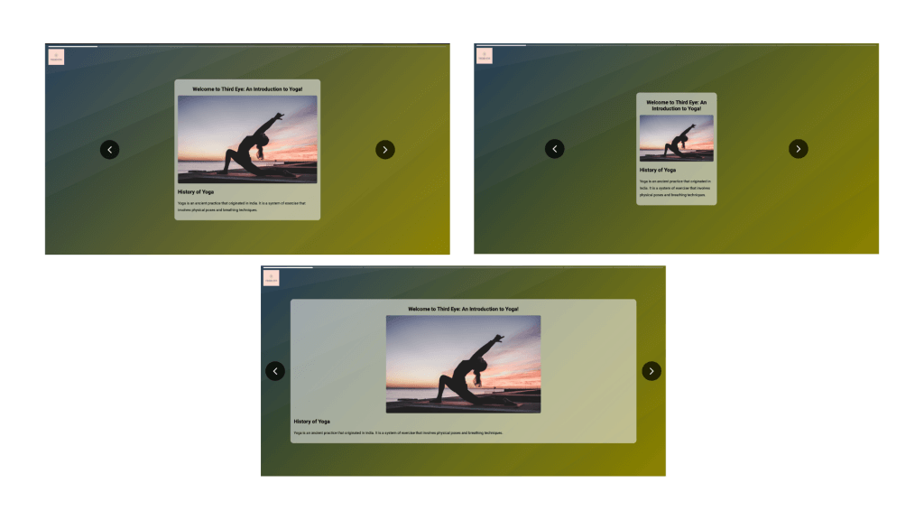
There are 3 options for card stretch: narrow, medium and wide. Narrow stretch is especially functional for mini-courses which are intended to be viewed on mobile devices in the first place.
Note: This option is not present for the default card layout.
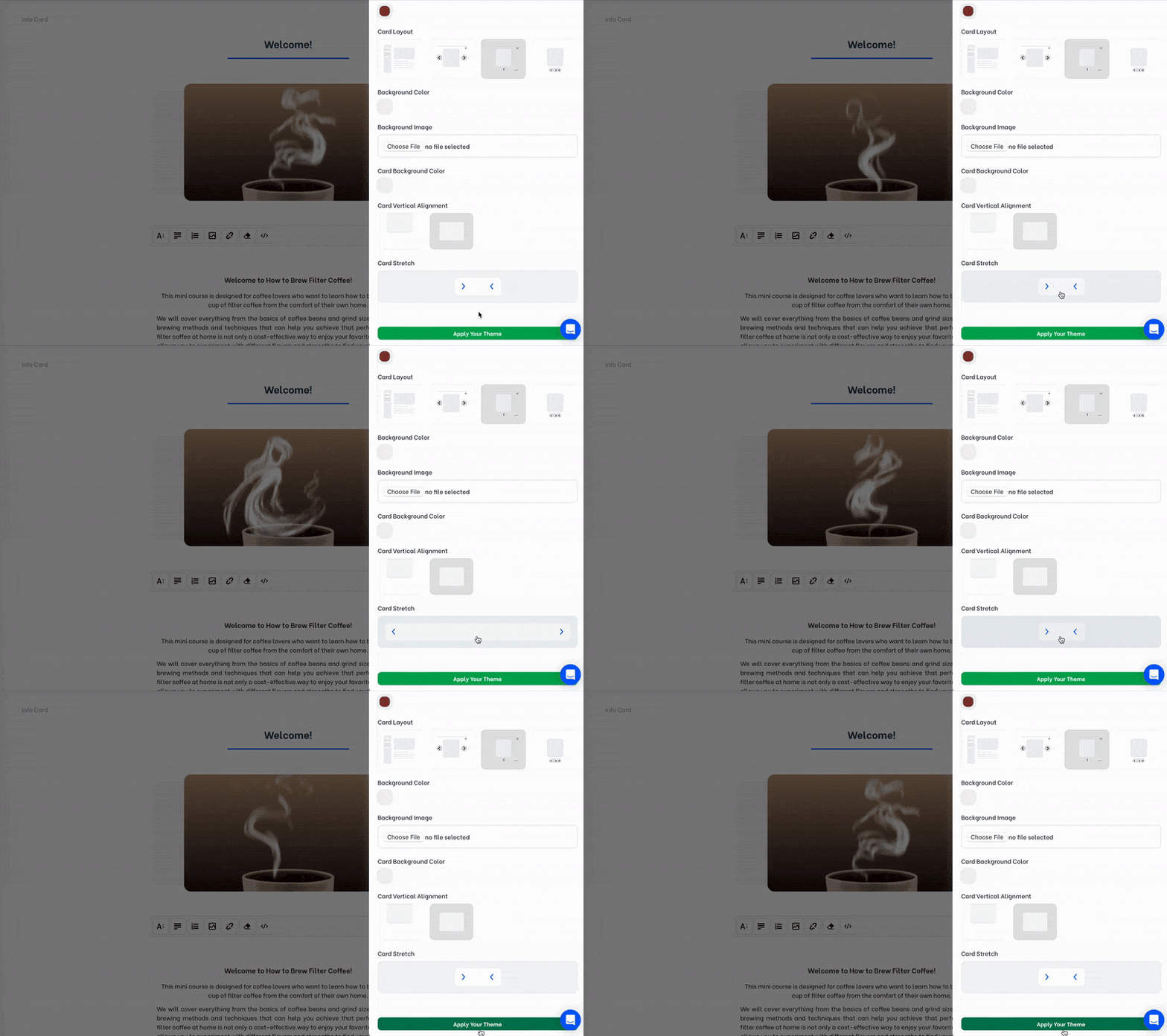
Find below the same mini-course card showcased stretch options medium, narrow and wide respectively.
Font Settings #
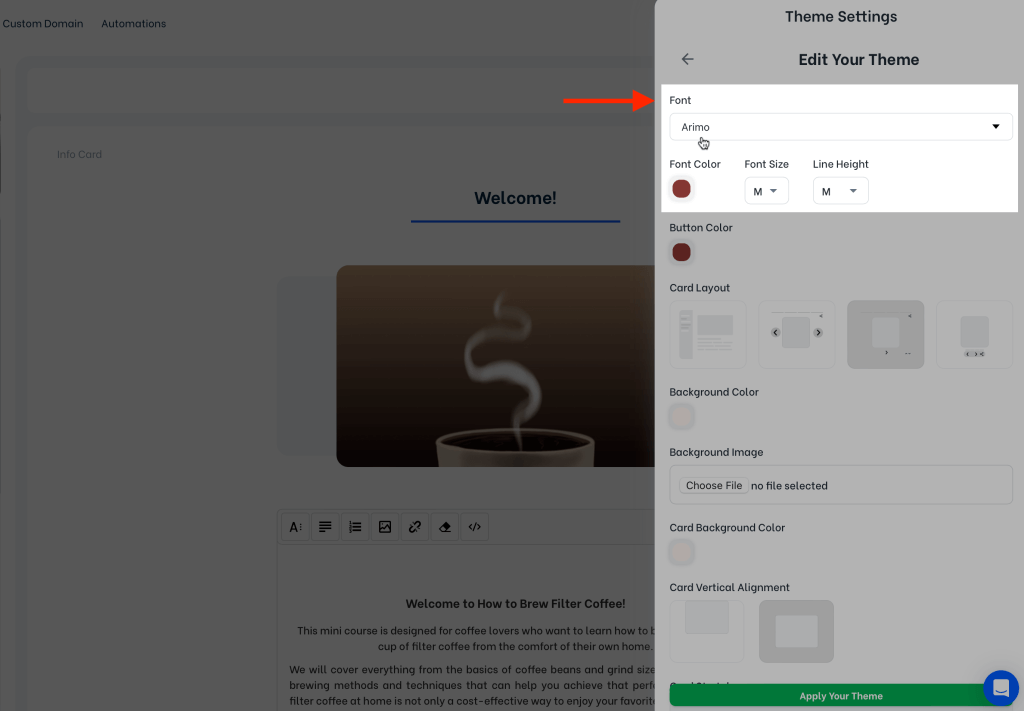
Change your mini-course’s font, font color, font size and line height.
Color Settings #
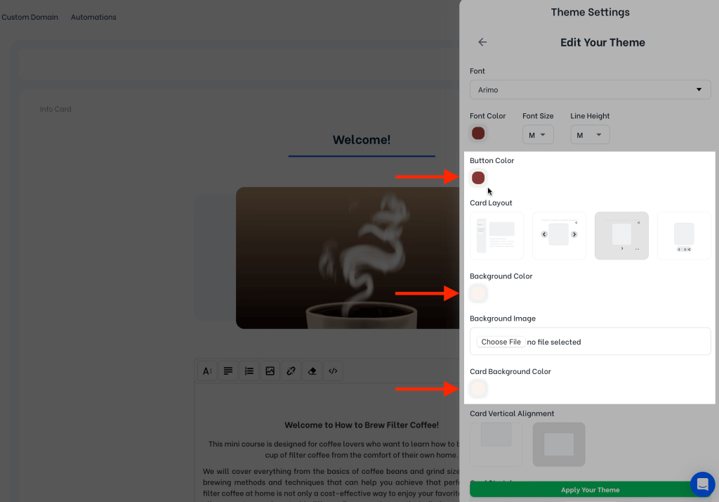
You can choose different colors for your background, card background and buttons.
Background Image #
If you prefer to have an image in your mini-course’s background, you can upload one using the background image section.
Note: This option is not present for the default card layout.
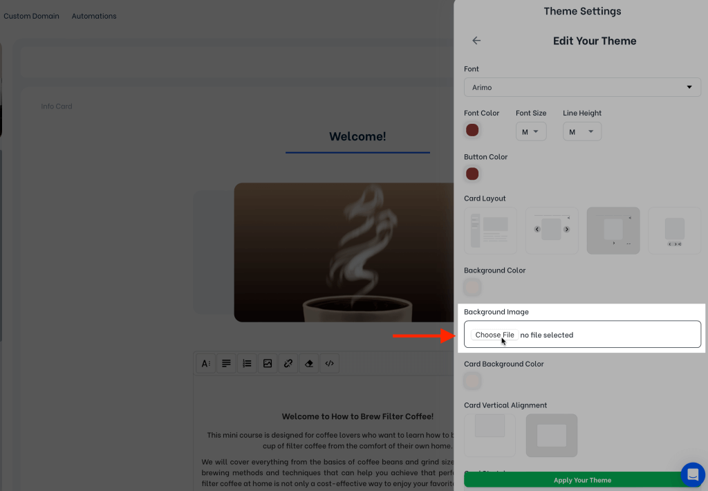
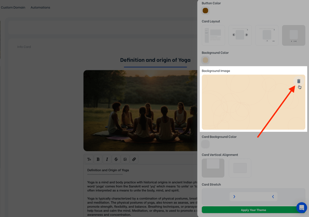
Some presets such as Circles and Rectangle Light include background images by default. You’re free to change these default background images. Click on the trash bin icon to delete the background image. After deleting it, you can upload a new one.
