

Measure customer education in two layers. Program metrics prove the machine runs: completion rate, quiz pass rate, reach. Business metrics prove it matters: feature adoption, ticket-class reduction, retention of trained accounts. The bridge between them is verified understanding: quiz-validated knowledge per customer. Everything else, especially raw enrollment counts, is decoration.
That two-layer discipline is rarer than it sounds. Most education dashboards report activity because activity is easy: enrollments climb, a chart goes up, nobody asks whether customers learned anything or whether anything downstream changed. Then the budget review arrives and the program cannot defend itself.
This guide gives you the full framework. It covers which metrics belong in each layer, the honest benchmarks that exist (and the ones that do not), the selection-bias trap in trained-versus-untrained comparisons, and the one-metric-per-course dashboard that survives a CFO.
Key Takeaways
- Measure in two layers: program metrics (completion, pass rate, reach) prove the machine runs; business metrics (adoption, ticket classes, retention) prove it matters.
- Verified understanding is the bridge: a passed quiz converts “they watched” into “they know”. Pageviews cannot.
- The benchmark that matters most is reach: on average only 29% of a customer base engages with training annually (Skilljar 2022 benchmarks).
- The best-sourced outcome data: 38.3% higher adoption of trained products and 15.5% lower support costs (Forrester Consulting study commissioned by Intellum, 2024).
- Trained-vs-untrained comparisons carry selection bias; read them directionally and pair them with before/after movement in tagged ticket classes.
The Two-Layer Framework
Every useful customer education metric answers one of two questions.
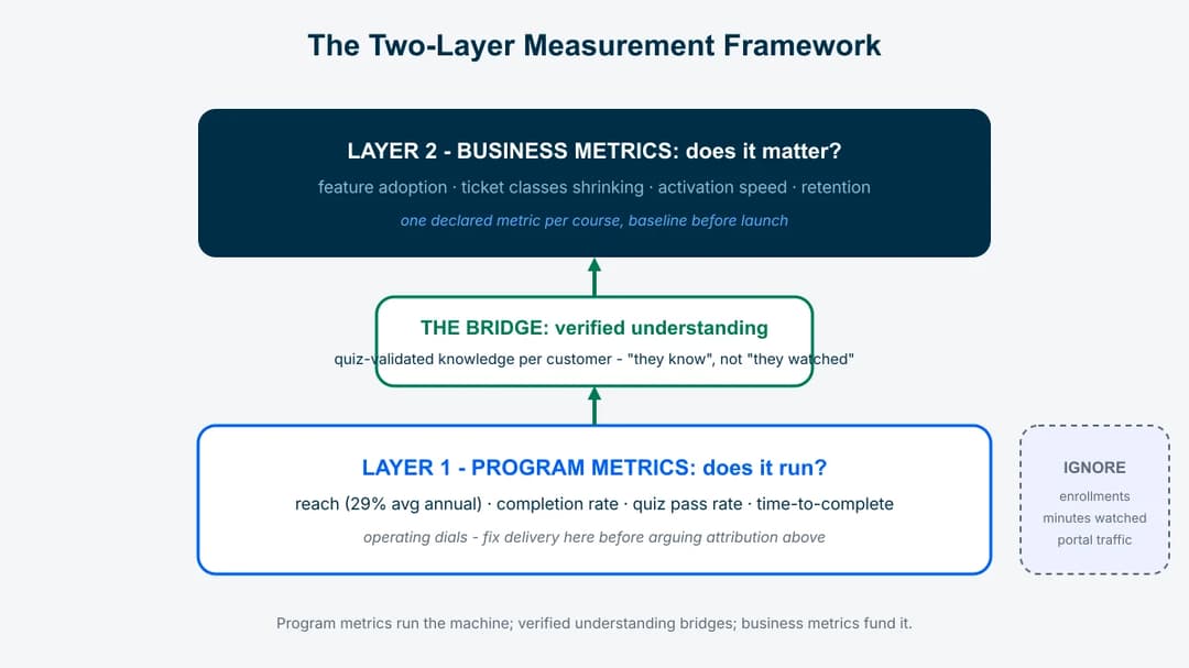
Layer 1 – is the machine running? Program metrics: who was reached, who finished, who understood. These are your operating dials. They diagnose content and delivery problems fast, and they mean nothing to your CFO on their own.
Layer 2 – is the machine changing anything? Business metrics: what the trained customers now do differently. Feature adoption, support volume in specific ticket classes, activation speed, retention. These move slowly, get confounded by everything else your company does, and are still the only numbers that fund the program.
The order of operations matters. Layer 1 problems (nobody finishes the course) make Layer 2 measurement pointless; fix delivery before you argue about attribution. And a program reporting only Layer 1 is announcing that it has not asked whether it works.
Layer 1: Program Metrics
Reach. The share of your active customer base that touched education in a period. This is the metric most programs quietly fail: Skilljar’s 2022 benchmark survey found an average of just 29% of a customer base engages in training annually. If your reach is low, nothing else on the dashboard matters yet. The fix is almost always delivery: education inside the product and support channels, not in a separate portal. That is the core argument of our customer enablement framework.
Completion rate. Completions divided by starts, per course. Low completion diagnoses content problems: too long, wrong level, wrong moment. Short interactive lessons complete at multiples of hour-long recordings; if a course underperforms, cut its length before rewriting its substance.
Quiz pass rate. The share of completers who demonstrate understanding. A high completion rate with a low pass rate means people clicked through without learning, which is a course-design signal, not a learner problem.
Time-to-complete. How long from enrollment to done. Useful mostly for onboarding courses, where it feeds directly into time-to-value.
What to ignore at this layer: cumulative enrollments (a vanity number that only goes up), total minutes watched (it rewards long content, which is backwards), and portal traffic (navigation, not learning).
The Bridge: Verified Understanding
Between “they finished” and “the business changed” sits the metric that makes the whole framework work: verified understanding, meaning quiz-validated knowledge per customer per topic.
It matters for two reasons. First, it is the honest version of completion. A customer who passed a five-question quiz on your reporting module demonstrably knows the module; a customer who scrolled a help article demonstrably scrolled. Second, it makes Layer 2 claims defensible. “Accounts that passed onboarding verification activate 40% faster” is an argument; “accounts that visited the academy activate faster” is a correlation with motivation.
Practically, this means every course ends with a short quiz, pass rates are tracked per topic, and certificates document the verification for the customer’s side. Platforms handle this natively; the framework only requires that you refuse to count unverified completions as learning. In customer training software terms, this is the Knowledge Validation layer, and it is the single feature that separates measurement-ready education stacks from content libraries.
Layer 2: Business Metrics
Pick ONE per course, at build time, not retroactively. A course exists to change something specific; name it before you ship.
Activation and time-to-first-value – for onboarding courses. Compare activation rates and days-to-first-value for customers who completed (and passed) onboarding education against your baseline.
Adoption of trained features – for feature courses. The best-sourced external benchmark: a 2024 Forrester Consulting study commissioned by Intellum measured a 38.3% average increase in adoption of products targeted by training. The practical corollary: adoption gains concentrate on what you teach, so point courses at the features tied to renewal.
Ticket-class volume – for support-driven courses. Tag the repeat question classes each course targets and watch the class, not total ticket volume (which moves with growth and seasonality). The mechanism and the honest math live in our ticket deflection playbook; the same study above measured a 15.5% average decrease in customer support costs from formalized education.
Retention and expansion of trained accounts – for the program as a whole. Read on, because this one carries a trap.
The Selection-Bias Trap
Trained accounts renew better than untrained accounts in almost every dataset, and the comparison is almost always inflated. Motivated customers both seek training and succeed; the training did not cause all of the difference. Presenting the raw gap as program ROI is how education teams lose credibility with finance.
Three honesty rules keep the claim defensible:
- Read cohort gaps directionally, as evidence that education correlates with health, not as a causal ROI number.
- Pair them with before/after movement in the metrics a course explicitly targeted: the tagged ticket class that shrank after the course shipped is much harder to explain away.
- Label external benchmarks. The Forrester/Intellum figures are self-reported outcomes from a commissioned study with a stated method (n=300, 2024). Quote them with the label, as we do in our customer education statistics guide, which spells out the sourcing rules behind every widely quoted customer education figure.
Building the Dashboard
The dashboard that works fits on one screen and follows three rules.
One business metric per course. Declared when the course is built. The dashboard row reads: course, reach, completion, pass rate, target metric, target movement. Any course whose row cannot name a target metric is a candidate for retirement.
A named owner and a monthly cadence. Metrics nobody reviews are decoration. The program owner (in most teams, the person running the whole customer education program) reads the dashboard monthly, kills or fixes the bottom course, and doubles the winning delivery pattern.
Baselines before launches. Capture the ticket class volume, the feature adoption rate, and the activation speed before each course ships. The single most persuasive artifact in a budget review is a before/after chart with the course launch date drawn on it.
What Good Looks Like: Honest Benchmarks
A benchmark table you can defend, with labels:
| Metric | Honest reference point | Source and label |
|---|---|---|
| Annual reach of customer base | 29% average; leaders push well past it | Skilljar 2022 benchmark survey |
| Adoption lift on trained products | 38.3% average, self-reported | Forrester Consulting study commissioned by Intellum, 2024 |
| Support cost reduction | 15.5% average, self-reported | same study |
| Completion rate | No credible cross-industry standard exists; benchmark against your own courses by format | – |
| “Good” deflection rate | Vendor claims range 20-40%; no independent standard | labeled vendor claims only |
The empty cells are the honest part. Where no defensible external benchmark exists, your own trend line is the benchmark, and pretending otherwise is how dashboards inflate.
Conclusion: Measure Competence, Fund Outcomes
How to measure customer education, compressed: run two layers, bridge them with verified understanding, and declare one business metric per course before it ships. Respect the selection-bias trap when you compare cohorts. Reach is the benchmark to attack first, because the average program touches only 29% of its customers, and no metric improves on customers the program never reaches.
Start smaller than a measurement project: pick your three live courses, name each one’s target metric, and capture baselines this week. The customer training software layer handles the tracking mechanics; the discipline of refusing vanity numbers is yours, and it is the part that makes the program fundable.
Frequently Asked Questions
How do you measure customer education?
In two layers. Program metrics (reach, completion rate, quiz pass rate) prove the machine runs; business metrics (feature adoption, targeted ticket-class volume, activation speed, retention of trained accounts) prove it matters. Bridge them with verified understanding: quiz-validated knowledge per customer, so claims rest on demonstrated competence rather than pageviews.
What is a good completion rate for customer education?
There is no credible cross-industry standard, and most published numbers are unlabeled vendor claims. Benchmark against your own courses by format instead: short interactive lessons against short lessons, not against hour-long recordings. A falling trend on one course is a real signal; a comparison against a marketing benchmark is not.
What is the ROI of customer education?
The best-sourced external data: 96% of organizations report positive ROI (Forrester Consulting study commissioned by Intellum, 2024, n=300, self-reported). The same survey measured 38.3% higher adoption of trained products, 15.5% lower support costs, and a 7.6% average revenue improvement. For your own ROI case, before/after movement in each course’s declared target metric beats cohort comparisons, which carry selection bias.
Which customer education metrics matter to leadership?
Business outcomes with baselines: targeted ticket classes shrinking after courses shipped, adoption of revenue-relevant features, activation speed, and directional retention gaps between trained and untrained accounts, honestly labeled. Lead with one before/after chart per course; leave enrollments out of the executive summary entirely.
How often should you review customer education metrics?
Monthly, by a named owner, on a one-screen dashboard: course, reach, completion, pass rate, target metric, movement. The cadence exists to force decisions (kill, fix, or scale each course), not to admire charts. Quarterly, revisit baselines and retire courses whose target metrics never moved.